Category Archives: Review

Monteverde Impressa–Long Term Review

Note: Once again I have to thank the kind folks at Pen Chalet for donating this pen. The pen is currently out of stock, but if you’re interested in getting one, you can ask for notifications at this link  in case they become available again.

The Monteverde Impressa is an odd pen that may serve as a good first fountain pen, but for reasons that may be out of the ordinary.

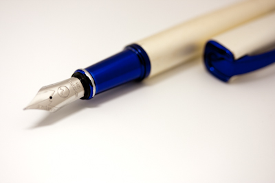
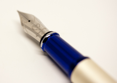
In the ten months I’ve used it since my initial impressions, I haven’t had any great technical problems. The nib writes well and I’ve liked using the pen. The cobalt blue and pearl white look attracted a lot of attention in a “Wow, that’s really cool, can I try that” sort of way as opposed to the “That’s sure a big old pen, ain’t it” attention my Shawn Newton Moody often attracts.

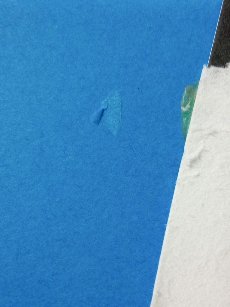
The only issues I’ve had have all been cosmetic. The most obvious is that the cobalt finish on the end of the grip section has peeled off.

The pen with part of the finish gone.

A different angle on the problem.

Also, over time the pearl material on the barrel has developed some odd black scratches.

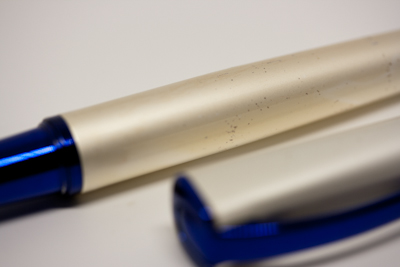
Some of the scratches on the barrel.

This will be off-putting to a lot of true pen addicts, but in an odd way it makes the Impressa a good gateway drug, er, starter pen:  1) It’s inexpensive but doesn’t feel or look cheap. 2) It looks cool and attracts positive attention. 3) It writes well.

However, it’s not a family heirloom kind of pen. A year of solid use will produce chipped sections and scratches. Eventually, the new pen user will become annoyed by the dings and scratches and move on to more expensive pens.

At that point it will be a good pen for testing inks the newly minted addict’s are afraid to try in their more expensive fountain pens.

Second Note: The pictures are sized too small. Sigh. Will fix that another day. –DL


Star Wars at Forty

Note: I’ll not give any solid spoilers, but I will comment on a few things. I also can’t promise this will be coherent.

I can’t help it, even though I know it’s coming. That sequence of “A long time ago in a galaxy far, far away…”, the pause, and then the punch and scroll brings chills every time it happens and I always feel ten years old even though that first happened, well, a long time ago in a country far, far away.

Prior to seeing this episode of Star Wars I not only avoided reviews and any hint of spoilers, which was difficult as I couldn’t watch it on opening night, I also didn’t watch the Japanese trailers as they are notorious for giving away key details. My goal was to go in as unbiased and unprepared as possible.

All in all I liked the movie, although I’m glad I saw it at a discount. The popcorn was also good.

If you can take seriously the notion that the members of the misnamed resistance (they are actually the badly managed vestiges of the old order in a long running civil war) are supposed to take seriously the orders of a magenta-haired admiral in an evening gown who wears no obvious signs of rank, then all the rest of the movie falls into place. (A–How do I know she’s an admiral? B–Because I say so and because she looks fabulous.) Something like that.

Well, that and you have to accept the notion of space bombers flying in close formation. You have to accept that, too. (See “badly managed” above).

Oh, and you have to accept the notion of space bombers.

The main problem is there are too many characters doing too many things that ultimately contribute nothing to the final. There is some sort of message about sacrificing yourself or not and letting the past go or not but that gets lost in all the subplots.

Kelly Marie Tran  and John Boyega steal the movie in their extended, yet meaningless sequence. They have great chemistry and Tran actually looks like someone who works in maintenance and gets her hands dirty for a living.

Adam Driver is excellent and his personality dominates the movie enough that you wonder why anyone would take Daisy Ridley’s Rey seriously.

The rest of the movie is mostly fun, although it does drag at times. It is also highly manipulative in the way it puts main characters in harm’s way and then quickly rescues them.

There are also odd sequences involving the source of blue milk that are there to either show off a special effect, answer a question no one ever asked, or both. Also, the movie ends too many times.

That said, I’ll look forward to episode nine when it comes out in a couple years. I’ve stuck with it for forty years, I might as well give it couple more.


Field Notes “Resolution” Edition–Initial Impressions

The short version is: what I normally hate I actually like and what I don’t need I no longer have. Also, I’m mad I didn’t get to ruin one of them myself.

The Field Notes “Resolution” edition is offered as a productivity kit that offers two books of pre-made to do lists (called Checklist Journals) and week-per-page free diary for people interested in a pocket diary that fits Field Notes covers.

The three parts of a “Resolution” pack.

The colors are great, with my favorites being the white and blue covered versions. The red version, with blue lettering, is a bit vibrant for my taste and I wish it had white lettering.

My first serious complaint came when I discovered that my belly band had been glued to the blue Checklist Journal and I had to slightly damage the cover to take it off. (Note: this only happened in one pack.)

The damage and the glue.

Granted, this isn’t that big of a problem except that I like to ruin my own books in my own way. I compare this to having someone dog-ear the page of one of my books. Yeah, the book hasn’t changed and it can still be read, but that doesn’t mean the person who damaged it doesn’t deserve a slow and painful death.

What I really like, though, is something I usually hate. As a rule, I’m not a big fan of gridded pages. The grids break up the ink, even when it’s just a dot grid. I prefer lined or blank pages in my journals.

The Checklist Journals have an interesting spin on this problem that actually makes it work for me. The paper is grey with printed white space. Some have complained that the white printing makes the same ink look different than it does on the grey paper.

However, this also makes the various entries easier to identify. Granted, I force myself to use one line, which can lead to code breaking sessions where I try to crack my own notes, but it makes it the do lists easier to read.

The same ink on different lines. Looks different, but each entry is easy to identify.

Because of this, and because I like the size, the Checklist Journals will stay in my office and will serve as my work to-do lists. I’ll have a more thorough review of them some day.

As for the Date Books: although I like their red on white covers, I don’t need them and have already given them away to people I’m slowly infecting with the Field Notes virus.

PLUS Ca.Crea A4/3 Premium Cloth Notebook–End of Book Review

The Ca.Crea A4/3 from PLUS Corporation is an odd notebook that I like; however, I can’t quite figure out if I ever want to use another one.

Let me start with the negatives:

First, the name is terrible. The first part of the name (Ca.Crea) is pronounced “Kah Kree-uh) and the second part (A4/3) is unpronounceable, although it is often written as A4 x 1/3.

It’s almost as if someone responsible for naming got confused and handed in their daughter’s algebra class notes instead of the slip of paper containing their name recommendations.

Detail of the name on the front cover. If you figure out how to pronounce this, please contact me.

Second, the size is odd. It is 215 mm X 105 mm which makes it one-third the size of a piece of A4 paper and 5 mm longer and 5 mm narrower than a standard refill for a Travelers Notebook. In fact, it fits a Traveler’s cover quite nicely (albeit after some careful page counting.)

However, because I’m not a big fan of the Travelers system, this is not a huge plus for me.

The Ca.Crea A4/3 in a Traveler’s Cover.

The Ca.Crea A4/3 (bottom) in a Travelers Cover.

On the other hand, the 56 pages of cream paper and 5mm dot grid are excellent to write on. They are very fountain pen friendly and they allow for bottled inks to show off their shading without any feathering. Also, the ink writes over the dot grid meaning the dot grid doesn’t break up the ink lines. (This aspect of gridded notebooks is a pet peeve of mine, even though I have to look closely to be annoyed by it.)

The paper is a bit slick and tends to dry much more slowly than I’d like, but it handles almost every ink well. Even Wancher Matcha, the heart breaker (it breaks hearts) didn’t soak through except where I scratched the paper.

I did find the paper to be very unforgiving to italic and stub nibs when I got even slightly off the sweet spot.

Wancher Matcha on one side with the “drying” times.

The back side of the sample. The yellow marks are “it dries eventually” Noodler’s Apache Sunset from the facing page.

The other advantage of the Ca.Crea A4/3 is that the perfect bound and stitched pages will open flat. It’s also possible to fold the “premium cloth” cover and used pages around to make everything easier to hold when you don’t have access to a desk or a friendly shoulder. It will then close naturally without the covers being sprung.

This may be my favorite aspect of the notebook. Although it won’t fit easily in a pocket, it is easy to hold and use.

It comes in several colors with different color inner covers and facing pages. (The insides of mine were light pink.)

Although I like the notebook, and would probably use it regularly if I liked the Travelers system, I’m not sure if I’ll get another one. I do think it’s worth checking out though.


Story Supply Co. Pocket Staple – Edition 407–First End of Book Review

I like the Story Supply Co. Pocket Staple – Edition 407 enough that I’m going to use another copy as soon as I can just so I can abuse it more.

The Edition 407 is named in honor of the 407 backers (this author included) who supported the original Kickstarter campaign. The original notebooks were nice, and still among my favorites, but it’s interesting to see how they’ve refined their production quality.

The notebook looks great. I especially like the 100# linen-finished burgundy cover. Unfortunately, because I kept it in a notebook cover, it remains pristine and hasn’t been given an honest test.

The front cover. It looks new and that isn’t right for a long term review.

Detail of the embossing on the front cover.

Inside, the 70# cougar paper is excellent. It doesn’t feather and is pleasant to write on. Only a couple of inks bled through, and only when I was trying to make them bleed. Even Wancher Matcha, which is usually the heartbreaker, didn’t bleed unless I tried to make it bleed.

Close up of some horrible handwriting on top of some bleed through. The green dots are Wancher Matcha.

My only complaint is a minor one. The insides of the front and back cover have writing and rulers on them. The writing explains the Story Supply Co. mission and offers a place to make a table of contents. The problem is, all the writing is black on burgundy so it’s difficult to read.

I personally would prefer to have the covers blank inside so I can make my own messes.

Once my current food journal is used up, I’m going to jump my planned notebook queue and use another Edition 407. I’m interested in seeing how well it holds up after being carried in a pocket for a couple weeks.

Quad Field Notes Leather Notebook Cover–Even Longer Term Review

After carrying the Old Church Works Quad Field Notes Leather Notebook Cover for over 20 months now, I’ve reached the conclusion that its strength is its weakness.

Although it has aged beautifully–the patina compared to when it was brand new is awesome–the thick leather never softened as much as I’d hoped. Although I open and close the Quad several times a day, it still won’t stay open when I just let it sit and try to transcribe my notes. It’s easier to take the notebooks out and open them.

The Quad cover showing off its excellent patina.

Part of it is my fault as I started using it to hold a full complement of four notebooks knowing that would make it uncomfortably thick. In fact, it’s as thick as keeping a small paperback with leather cover in your pocket. However, it is designed to hold four notebooks so I thought I’d use it as intended.

The Quad with four notebooks is quite thick.

However, I’ll probably be either dropping down to two notebooks, or simply pocket carrying the two I use the most and keeping the Quad in my book bag with the notebooks I don’t use very often. This is not the Quad’s fault, but a problem with me constantly changing my system.

Also, the Quad protects notebooks so well you can’t really test much about the notebooks other than the paper.

The only durability issues I’ve noticed with the Quad are that the elastic band holding the cover closed is starting to fray. At this point it’s only an aesthetic issue, but it is something to watch.

I still like the Quad better than the Midori Passport sized, and will probably start using it again eventually, but I’d still love to see a version with thinner, softer leather.

ensso Piuma Super Minimal Aluminum Fountain Pen–Initial Impressions

The ensso Piuma is a great pen for three years ago. In 2017, though, I’m not sure how it fits into the market.

The Piuma came in padded black cardboard box with the ensso name stamped on the top. The pen was packed tight enough that I had a hard time getting it out of the foam. (Not a good initial impression, but the pen was definitely secure in the box.)

The ensso logo a decent look at the pan’s finish.

The Piuma is a good looking pen. I chose the black aluminum version with a black steel nib and every one who’s seen it likes the black on black look. In keeping with the “Super Minimal” concept It is a basic cigar shape with no clip. It is 140 mm (5.51 inches) long when capped and 128 mm (5.03 inches) long when uncapped. Because the pen is designed not to post, it is right at the edge of too small to be comfortable for my taste, but my budding pen addict colleague liked how it felt and wrote.

The ensso Piuma.

The Bock #6 nib is smooth and well tuned and although the pen’s black finish is quite slippery, which my colleague also noted, I like the lip at the end of the section. The shaped section puts it ahead of my Namisu Nova Minimal fountain pen which had a fairly fat and slippery section.

Detail of the Bock nib and the lip at the end of the section. The discoloration is the remains of leaked LAMY Petrol.

It is also a very light pen for its size: 1.12 ounces (32 grams) capped and .83 ounces (23 grams) uncapped. I imagine that once the slippery finish breaks in a bit it will be a good pen for longer writing sessions.

The only issue I’ve had, besides getting it out of the packaging, is that in the jostling of my morning commute it leaked ink all over section giving me LAMY Petrol fingers when I started to write with it. I checked the tightness of the feed and nib unit and the problem wasn’t repeated on the commute home.

My other problem at this point is where to put this pen in the market. It is of a style of machined pen that was a big deal a few years ago, but now seems almost retro. Even dubbing it as “minimal” reminds me of pens I already own including one that is nearly identical to the Piuma.

A pen configured the same as mine sells for $79 retail on the ensso website. This seems to me to put it in an odd spot in the market. It is too expensive to be a starter fountain pen and there are cheaper options–TWSBI 580s for example–with more ink capacity for people interested in taking the next step down the fountain pen rabbit hole.

I got mine via a Kickstarter campaign for US $45 (not including shipping) and that seems to be a better price point for a pen of this kind. It looks cool and is comfortable to write with and it does turn heads, but it may be out of date.

That said, these are just initial impressions and the Piuma is now part of my pen testing rotation. I’ll give it a proper review in six months or so once we’ve had the time to get to know each other better.


Field Notes Utility–End of Book Review

I let my colleague from England handle one of my Field Notes Utility notebooks and he was so impressed by the paper that I gave him one of my copies.

The paper is what I like best about the notebook although there are a few issues with the notebooks themselves.

The Field Notes Utility edition has an attention getting Safety Yellow and black cover that has the interesting touch of showing you what flavor of paper is inside. The Utility comes in two rulings: Ledger and Engineer Grid.

(Note to Field Notes: How about a special set of notebooks served in three bundles of two: Two grid, two lined, and two blank? Or how about just a very special edition with blank pages? You could call it the “Shut-up Lively” Edition.)

The cover of the Field Notes Utility edition with the ledger sample at the bottom.

I started with the ledger version because I figure it’s the version I’ll like the best. It’s the closest to lines and I’m not a huge fan of engineer grid pages. The ledger style also seems like a natural fit for a bullet journal, To-do lists, or 10 Ideas lists.

The paper itself is an impressive 70# “Pure White” Mohawk Via Vellum ruled in something called “Get-It-Done Gray,” (That should be “Git-R-Done” gray as that is what I always call it by accident. I understand that there may be trademark issues involved with that.) The paper makes it one of my favorite Field Notes notebooks as it handles fountain pens and fountain pen inks well. It even handled Wancher Matcha admirably.

It does have a lot of tooth to it, which means the only thing that didn’t feel right, and I found this very odd, were fine tipped gel pens. Also, my Pilot Prera stub nib didn’t work very well, but that may have been because of the Kyo-iro Stone Road of Gion ink which I find to be a rather dry ink, albeit with a terrific color.

Several inks in my horrible handwriting. You also get a good look at the ledger ruling.

The back side of the same page. For Wancher Matcha, that is an excellent result.

Where most people have had problems is with Utility’s covers. First, because the notebook has heavy paper it is thicker than most Field Notes editions. This led to some people opening fresh packs to discover spines split from the first staple to the end. I didn’t have that trouble but it is something to be worried about when buying a pack.

This is the worst damage done to the spine. Note the black staple.

The other issue people have had is the fact the cover comes with a built in fold-out ruler with both inches and centimeters. To accommodate this the back cover doesn’t completely cover the paper as if the cover had been poorly cut during the production process. I haven’t found this to be a problem, although it does feel funny when you flip through pages.

I like having the combined inches/centimeter ruler and plan to cut it off to use a bookmark for future editions.

The underside of the fold-out ruler.

Although the Utility is one of my favorite editions, at least in ledger form, it’s a difficult notebook to recommend for first time Field Notes notebook users. Although the color is great, the cover is odd. I’ve also not tried the engineer grid yet. As I suspect I won’t like it as much, it may be too soon to offer a proper review.

Field Notes Black Ice–End of Book Review

I like everything about the Field Notes Black Ice limited edition except the cover, and even that doesn’t bother me very much.

With the entire cover foil stamped and with orange binding tape on the PUR bound spine, the Black Ice seems designed to attract attention in ways that other Field Notes limited editions aren’t. The America the Beautiful edition is gorgeous and nostalgic, but it won’t flash sunlight in someone’s eyes all the way across the room. You can’t signal a rescue helicopter with it, either.

The foil stamped cover is reflective, but you can’t see your face clearly in it and it doesn’t show finger prints unless you look closely at them.

Finally got Black Ice from @fieldnotesbrand #fieldnotes #selfie #notebooks #penaddict

A post shared by DL (@d.e.lively) on

The PUR binding is also interesting because it makes the Black Ice the first Field Notes limited edition of this size to be made without staples. (The Byline was a different format.) There isn’t anything particular special about this, except to give the notebook a different look. It does take a little effort to make it open flat though. You have to force the binding flat in a way that would crack the spine of a paperback book but doesn’t damage the Black Ice’s spine. This gets the user an extra bit of space (5 mm)on each page.

What wins my heart, though, is the paper. The 70# “Bright White” Finch Fine Smooth held up well to every ink I used on it. The only exception was Wancher Matcha, of course. It’s a heart breaker. It breaks hearts.

I prefer blank notebooks (are you listening Field Notes people?) but the gray lines are subdued enough they don’t dominate the page. The orange accent lines at the top are nice to look at, but I personally could live without them.

Wancher Matcha breaking hearts. For Matcha, though, this isn’t that bad.

My only complaint about the design is that, over time, the orange inner cover tends to rub color on the first and last pages. Also, because the cover stock is slick, it’s difficult to write on.

I’ve been really pleased with the Black Ice and it’s made its way into my top five Field Notes notebooks–which I will someday post–although this is mostly for the paper and the PUR binding not the foil stamped cover.

The Black Ice is also one of the few special editions that I’ve passed out to colleagues. The one who got Black Ice seems to like it a lot.