Tag Archives: Field Notes

Field Notes Utility–End of Book Review

I let my colleague from England handle one of my Field Notes Utility notebooks and he was so impressed by the paper that I gave him one of my copies.

The paper is what I like best about the notebook although there are a few issues with the notebooks themselves.

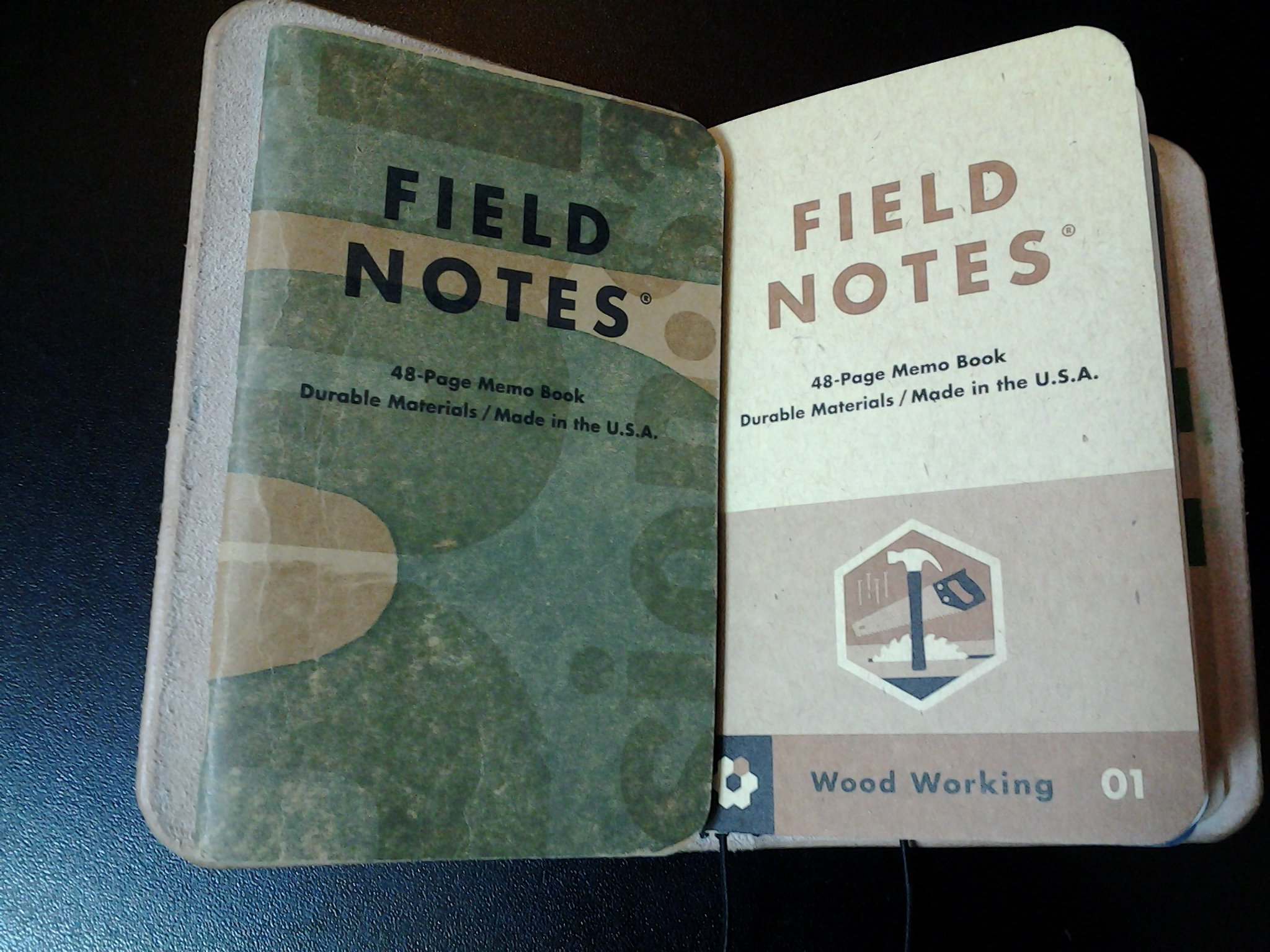
The Field Notes Utility edition has an attention getting Safety Yellow and black cover that has the interesting touch of showing you what flavor of paper is inside. The Utility comes in two rulings: Ledger and Engineer Grid.

(Note to Field Notes: How about a special set of notebooks served in three bundles of two: Two grid, two lined, and two blank? Or how about just a very special edition with blank pages? You could call it the “Shut-up Lively” Edition.)

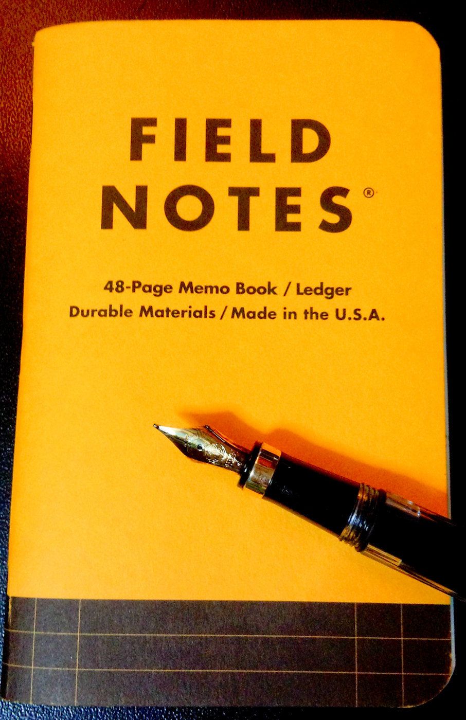
The cover of the Field Notes Utility edition with the ledger sample at the bottom.

I started with the ledger version because I figure it’s the version I’ll like the best. It’s the closest to lines and I’m not a huge fan of engineer grid pages. The ledger style also seems like a natural fit for a bullet journal, To-do lists, or 10 Ideas lists.

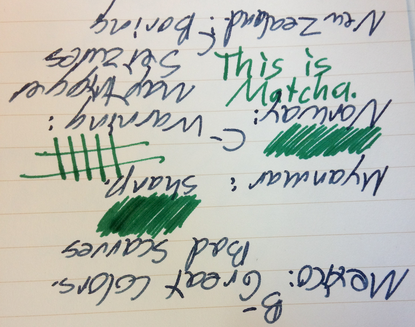
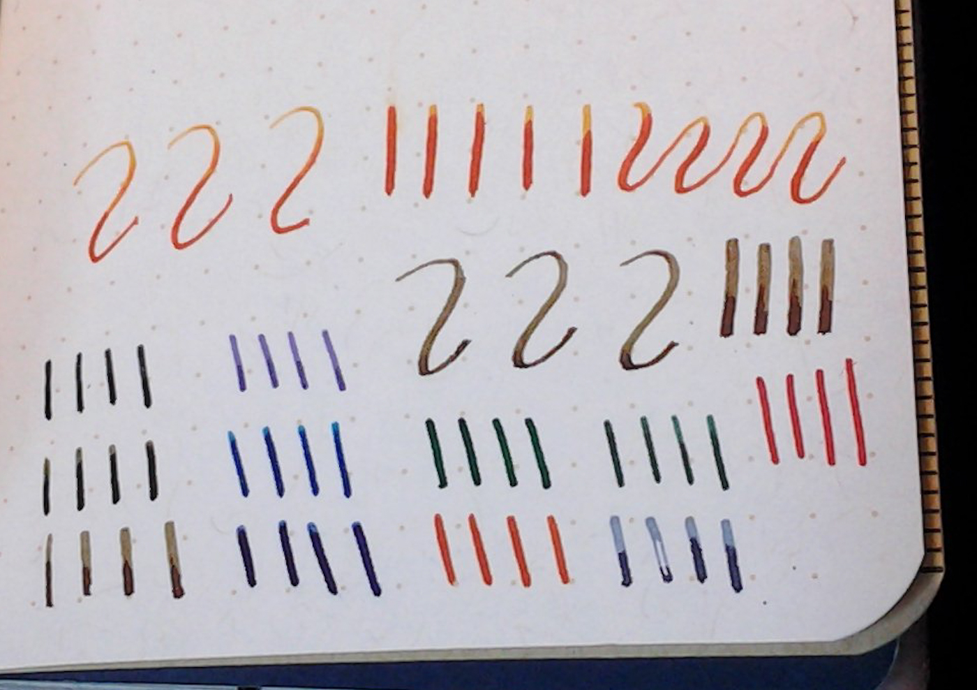
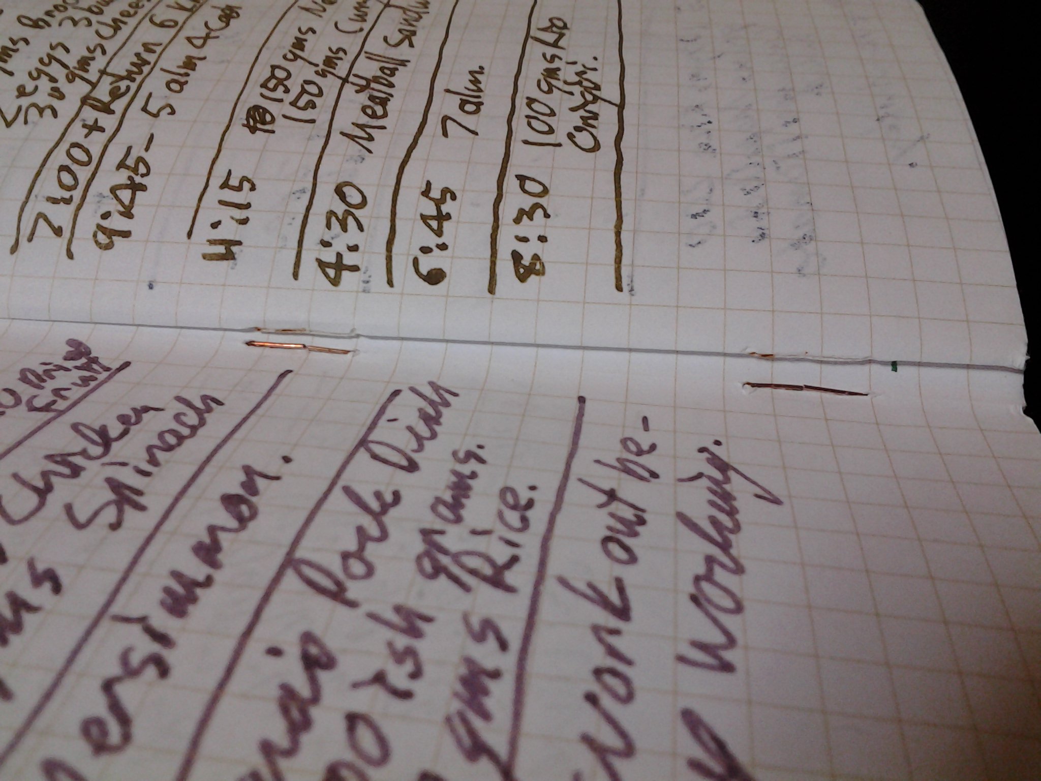
The paper itself is an impressive 70# “Pure White” Mohawk Via Vellum ruled in something called “Get-It-Done Gray,” (That should be “Git-R-Done” gray as that is what I always call it by accident. I understand that there may be trademark issues involved with that.) The paper makes it one of my favorite Field Notes notebooks as it handles fountain pens and fountain pen inks well. It even handled Wancher Matcha admirably.

It does have a lot of tooth to it, which means the only thing that didn’t feel right, and I found this very odd, were fine tipped gel pens. Also, my Pilot Prera stub nib didn’t work very well, but that may have been because of the Kyo-iro Stone Road of Gion ink which I find to be a rather dry ink, albeit with a terrific color.

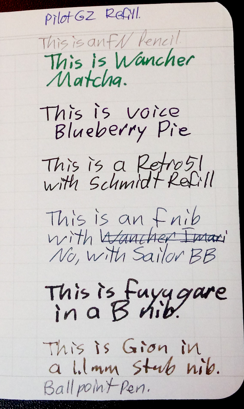
Several inks in my horrible handwriting. You also get a good look at the ledger ruling.

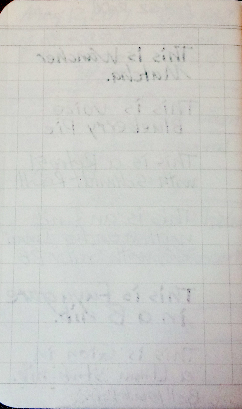
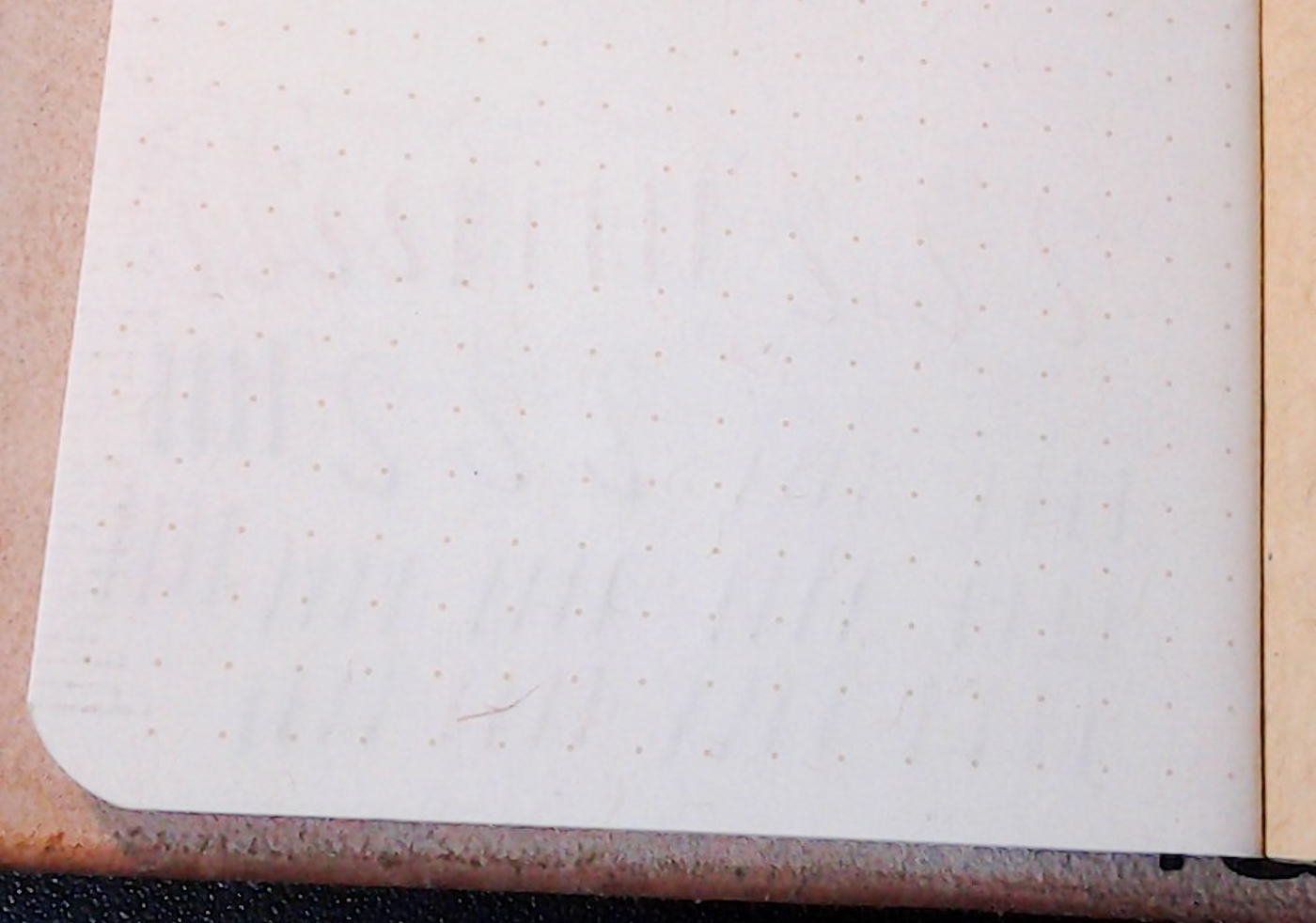
The back side of the same page. For Wancher Matcha, that is an excellent result.

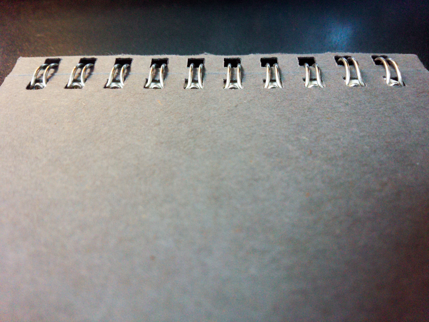
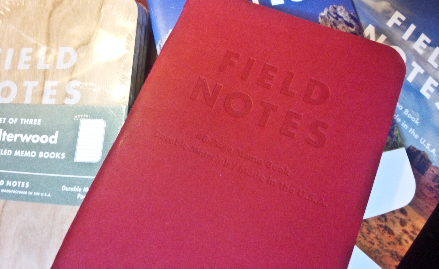
Where most people have had problems is with Utility’s covers. First, because the notebook has heavy paper it is thicker than most Field Notes editions. This led to some people opening fresh packs to discover spines split from the first staple to the end. I didn’t have that trouble but it is something to be worried about when buying a pack.

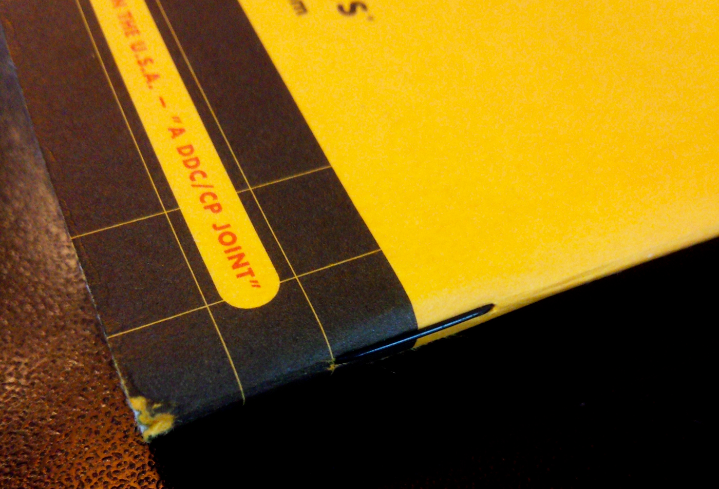
This is the worst damage done to the spine. Note the black staple.

The other issue people have had is the fact the cover comes with a built in fold-out ruler with both inches and centimeters. To accommodate this the back cover doesn’t completely cover the paper as if the cover had been poorly cut during the production process. I haven’t found this to be a problem, although it does feel funny when you flip through pages.

I like having the combined inches/centimeter ruler and plan to cut it off to use a bookmark for future editions.

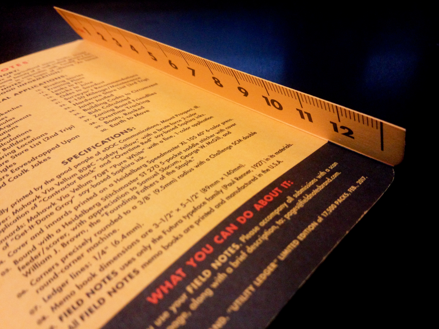
The underside of the fold-out ruler.

Although the Utility is one of my favorite editions, at least in ledger form, it’s a difficult notebook to recommend for first time Field Notes notebook users. Although the color is great, the cover is odd. I’ve also not tried the engineer grid yet. As I suspect I won’t like it as much, it may be too soon to offer a proper review.

Field Notes Black Ice–End of Book Review

I like everything about the Field Notes Black Ice limited edition except the cover, and even that doesn’t bother me very much.

With the entire cover foil stamped and with orange binding tape on the PUR bound spine, the Black Ice seems designed to attract attention in ways that other Field Notes limited editions aren’t. The America the Beautiful edition is gorgeous and nostalgic, but it won’t flash sunlight in someone’s eyes all the way across the room. You can’t signal a rescue helicopter with it, either.

The foil stamped cover is reflective, but you can’t see your face clearly in it and it doesn’t show finger prints unless you look closely at them.

Finally got Black Ice from @fieldnotesbrand #fieldnotes #selfie #notebooks #penaddict

A post shared by DL (@d.e.lively) on

The PUR binding is also interesting because it makes the Black Ice the first Field Notes limited edition of this size to be made without staples. (The Byline was a different format.) There isn’t anything particular special about this, except to give the notebook a different look. It does take a little effort to make it open flat though. You have to force the binding flat in a way that would crack the spine of a paperback book but doesn’t damage the Black Ice’s spine. This gets the user an extra bit of space (5 mm)on each page.

What wins my heart, though, is the paper. The 70# “Bright White” Finch Fine Smooth held up well to every ink I used on it. The only exception was Wancher Matcha, of course. It’s a heart breaker. It breaks hearts.

I prefer blank notebooks (are you listening Field Notes people?) but the gray lines are subdued enough they don’t dominate the page. The orange accent lines at the top are nice to look at, but I personally could live without them.

Wancher Matcha breaking hearts. For Matcha, though, this isn’t that bad.

My only complaint about the design is that, over time, the orange inner cover tends to rub color on the first and last pages. Also, because the cover stock is slick, it’s difficult to write on.

I’ve been really pleased with the Black Ice and it’s made its way into my top five Field Notes notebooks–which I will someday post–although this is mostly for the paper and the PUR binding not the foil stamped cover.

The Black Ice is also one of the few special editions that I’ve passed out to colleagues. The one who got Black Ice seems to like it a lot.

Giving Away the Old But Still New

At first they laughed. Then they took the notebooks. It solved problems for all of us.

Over a decade ago an online stationery shop I used on occasion went out of business when the owner graduated from school, got a “real” job, and no longer had time to dedicate to the business.

(Note: I cannot, for the life of me, remember the name of the shop, nor can I find any old links to it.)

Before the site shut down, though, the owner dumped the last of her inventory at surprisingly good prices. Because of this huge discount, I managed to acquire four large Moleskine notebooks (three lined, one blank) for around the price of one and a half Moleskine notebooks in Japan.

However, because I already had one notebook in use, and another in my notebook queue (oh, like you don’t have one) the four notebooks got stuffed into a drawer. Where they remained, still sealed in plastic, for over a decade.

In fact, if I’m remember the timing correctly, I may have got those four notebooks before we got our youngest daughter.

During yesterday’s office cleaning I pulled the four notebooks out of the drawer and looked them over. They looked to be in good shape with no obvious signs of mold or age. Because they are older Moleskine notebooks, they still have reasonably decent paper compared to more contemporary versions. I thought about keeping them, but then quickly decided to give them away as I no longer use large notebooks. (Instead I use a large number of small notebooks.)

As I have with Field Notes notebooks, I took them to school. With the Field Notes notebooks, I gave limited editions to my fellow foreign staff and left the craft cover versions in the main teachers’ office where they quickly disappeared. With the Moleskines, though, I walked around the English department repeating “free notebooks, really cheap, free notebooks, really cheap, take all you want.”

At first everyone who saw them laughed and then went “really?” I explained how they hadn’t cost me that much and how I’d never use them and wanted to get them into the hands of people who would use them.

I quickly passed out all four to Japanese teachers of various ages and watched as, for the first time in over a decade, the plastic wrap was removed and the notebooks were put to use.

It was oddly satisfying, especially as I now have room for more notebooks which, I realize, kind of defeats the point of giving some away.

Field Notes Snowblind–End of Book Review

One of the joys of a Field Notes subscription is you get a variety of notebook styles as the designers unleash their madness and their visions on the notebooks.

One of the horrors of a Field Notes subscription is you get a variety of notebook styles as the designers unleash their madness and their visions on the notebooks.

In the case of the Snowblind, you have a cover gimmick in desperate need of better paper. It’s more of a toy than a notebook, but even as a toy it has its advantages.

The paper in the Snowblind is 60#T paper that looks great with its light gray grid. However, it bleeds almost every ink that touches it. This doesn’t bother me as much as it probably bothers other fountain pen users, but it is noticeable. The paper feels excellent with ballpoint pens and gel pens, though.

The main gimmick of the Snowblind is the cover. It is a white cover treated with photocromatic blue ink. Once the notebook is exposed to sunlight it quickly turns blue. After you step back indoors, it quickly turns white again.

The Snowblind inside.

The Snowblind in sunlight. You can see some scuff marks near the spine.

It’s even possible to make patterns by putting items on the cover and removing them in sunlight. The effect, for a few seconds, is like one of Man Ray’s photograms.

Part of the annoyance of the Snowblind, though, is the effects of the change fade too quickly. It’s like pointing a flashlight at your little sister’s eyes to see her pupils get really small. (Oh, like you didn’t.) The effect lasts only as long as the flashlight is pointed at her eyes.

The gimmick is cool, or at least serves as a conversation starter, because nothing attracts people more than forcing them to stand in the sun whilst you hold your fingers over your notebook and say “Look now! Look now, quick!”.

That said, even in its white form, the cover looks good. I especially like the white staples holding it together. Also, the cover is durable.

It’s a good looking edition that I think people would be a good introduction to the Field Notes world for those who’ve yet to discover it. This is especially true if they like ballpoint pens.

In fact, the Snowblind is the kind of Field Notes edition you hand out as gifts as you probably never intend to finish them. It looks great and is kind of a fun toy, a few seconds at a time.

This may have been part of the diabolical plan: create a limited edition that subscribers will be in a hurry to give away.

Field Notes Lunacy–End of Book Review

For some reason, this song seems appropriate:

The Fall 2016 Field Notes Limited Edition looked really cool, then I started using it and things changed slightly. I liked the paper, but the gimmick is annoying, at least on the one I used.

The Lunacy, released about the time of the harvest moon, is a moon themed edition. The unique feature is covers cut in ways to reveal different phases of the moon. The three-packs available to the public contain the full moon, last quarter, and crescent moon. Subscribers received a fourth, uncut version representing the “new moon”.

Bad, so to speak, moons rising? #fieldnotes #notebooks #penaddict @fieldnotesbrand

A photo posted by DL (@d.e.lively) on

The covers look great, and have an interesting texture, but I found that with the full moon, as I flipped through the pages, my finger slipped through where I usually press. Or, it would flip at first but then the cover would bend and it would slap closed. It’s not a big deal, but it disrupts what should be simple process. I also don’t like the glossy end pages, even though they are necessary to pull off the gimmick and provide lots of interesting information. I’d rather have more pages I can use.

Detail of the cover showing the nice texture and the hole for the moon. (Also a Pen Addict Edition Retro 51 Rollerball.)

Some of the information. I would be 14.85 kg (32.73 lbs) on the moon and would rather have extra page.

I  like the embossed dark side of the moon on the back and would rather have seen the full, half and crescent moon done that way on the front.

I used it as my mini-planner for a couple months. The 60# paper was excellent and handled every pen well and almost every ink. (Wancher Matcha is the heart breaker. It breaks hearts.) I liked the gray reticle dot pattern, even though I generally prefer blank pages. The paper has a gray wash to it that I was worried about at first, but it didn’t cause any problems except to my eyes when they tried to adjust to what they were seeing.

I wouldn’t mind getting more copies, but I’d probably give away the full moon version and since my favorite, the new moon, isn’t available, I’m not sure getting only two notebooks for the price would be worth it.

Field Notes Sweet Tooth–Longish Term Review

I gave the blue ones away to our girls. As of today, our youngest doesn’t know where hers is. That pretty much sums up my reaction to the Field Notes Sweet Tooth Quarterly Edition.

For their quarterly editions Field Notes will, on occasion, attempt to shock its subscribers to the point that they begin to reconsider their subscriptions. They’ve changed the size, changed the shape, and used plastic paper that seems to work with only one or two ballpoint pens.

For the Sweet Tooth edition they did a good thing (offered a notebook with blank pages); a neutral thing (added perforations to the pages); but then did something that made the notebooks unusable (made the pages the same color as the cover).

When I got them I tested out a few pens and quickly realized that although the 70# paper was fountain pen friendly, the red only really worked with black ink and inks with sheen.

I quickly gave the blue ones (aka Blu-Raspberry) away and then tried to think of a use for the Redish and Yellow (aka Tangy Orange and Banana Split, respectively). I finally decided to use them in my class by making them the books for any “yellow cards” and “red cards” I give out. I can hold up the notebook, announce the card and then write the students’ names in the book.

The Banana Split and the Tangy Orange with a special warning stamped on the front.

The Banana Split and the Tangy Orange with a special warning stamped on the front.

In my system, three yellow cards equals a red card which equals homework. I will also give them out to an entire class during special activities where no Japanese is allowed. (The record: four red cards.)

The yellow and red card are noted. When three yellows become a red, they get crossed out.

The class yellow and red cards are noted. Please note the perforations. (Also: the colors are reasonably accurate here.)

That’s about all I can think of for ways to use this book. Some people use them to leave notes, others actually enjoy them for the artistic possibilities.

Although some of the experiments on the quarterly editions have been surprisingly good, (Arts & Sciences and Byline) this one is disappointing. The colors are great, but I’d rather see the colorful cover and blank pages; or to see lines or dot-grids that match the cover.

Once their gone, I’ll need a new red and yellow card system, but I won’t miss the Sweet Tooth much.

Field Notes Workshop Companion–End of Book Review

I just finished a notebook that was both friendly and unfriendly to fountain pens. I like it a lot, but it also kind of annoys me.

The Field Notes Workshop Companion Book 01 “Wood Working” is one of six notebooks in a boxed set sent as part of the Summer 2015 Field Notes Colors edition.

On paper, so to speak, it seems great. It has French Kraft-Tone 70#T “Standard White Craft” paper with a light brown dot grid pattern. 70#T paper is thick enough to handle most fountain pens and inks.

The notebook also looks great. Each book in the boxed set has a different color cover and a different “workshop” theme: wood working, automotive, gardening, painting, plumbing and electrical. Each book includes information and tips about its theme. The back of the Wood Working includes information on nail varieties, wood working jargon and the always wise “A table saw can be either your best friend or your worst enemy…”

The Workshop Companion on the right next to a used America the Beautiful edition.

The Workshop Companion (right) next to a used America the Beautiful edition.

The cover is 100#C card stock that features some excellent design work.

My back page tests showed that the paper could handle every fountain pen and ink I threw at it. Even the heartbreaker, Noodler’s Apache Sunset put down with a steel flex nib, didn’t bleed through or feather.

The pen tests. I push fairly had to leave as much ink as I can.

The pen tests. I try to lay down as much ink as I can. That’s Apache Sunset at the top and second from right at the bottom. The 1.1 stub looks great here (on the right above the red lines). 

The back side of the same page.

The back side of the same page. Even Apache Sunset with a flex nib couldn’t break it.

At this point I started to encounter my first “Hmmm” moment. My favorite Field Notes notebook, of the few I’ve used, is the America The Beautiful edition. It has Finch Paper Fine 70#T “Soft White” paper that was smooth and terrific to write on. Because both editions are 70#T, I was expecting a similar experience with the Workshop Companion.

However, the paper in the Workshop Companion notebook felt much rougher and stiffer than the paper in the America The Beautiful. As a result it was much more unforgiving with some of my pens. My Edison Glenmont’s 1.1 mm stub nib, for example, didn’t do well on the paper at all. Instead of a thick line, it tended to leave a thin line with little shading. Other pens did better, but I found the writing experience to be inconsistent and, depending on the nib, scratchy.

Also, although the middle page didn’t start falling out as in my Two Rivers edition, I could see that the staples were starting to give way even though the notebook had been carried in a cover rather than unprotected in my pocket.

The weak staple. You can also see how badly the stub nib does at the top of the picture.

The weak staple. You can also see how inconsistently the stub nib performs on the paper at the top of the picture.

I like the Workshop Companion a lot and it draws double takes from almost everyone who sees it. If the it had smoother paper and better staples it would be perfect. Instead, as is, it’s just very good. I’ll look forward to using the rest of the books, but I won’t rush to get more.


Field Notes Two Rivers Edition–End of Book Review

I was probably spoiled long before I started using the Field Notes Two Rivers edition. This is because the second edition I used extensively was the America the Beautiful edition, which used Finch “Soft White” paper that held up to fountain pens well.

I got a subscription to Field Notes colors editions mostly based on the looks of the Two Rivers edition. They are wood block printed by the Hamilton Wood Type & Printing Museum in Wisconsin. They come in four color stocks with nearly unlimited cover designs. I even bought a couple extra packs because for each sale a donation was made to support the museum.

When I came to finally use the Two Rivers edition, though, my reaction to the paper was “well, yeah, okay, hmmm”. First, compared to the AtB edition, the Two Rivers notebook is thinner, even though both have the same number of pages. The advantage of that is that it fits better in both covers and pockets. It also means the paper (Finch Opaque Smooth 50#T) is going to bleed.

I used my Two Rivers notebook as my most recent food journal which let me test several different pens on it. They all had a funny look to the lines and some odd bleed through. For the most part bleed through doesn’t bother me, but this paper seemed rough and the things I wrote seemed fuzzy and, in places, blotchy, but that might be an optical illusion from the grid lines on the pages. I don’t remember that happening in the Red Blooded edition I used.

The other issue I noticed was that the center pages started to come loose from the staples. This is something that didn’t happen with the Red Blooded or the AtB editions, even though the latter had thicker paper.

The paper coming off the staples.

The paper coming off the staples. You can also see the blotchy way the ink bleeds through on the top right. 

Keep in mind, I used this notebook in a cover so there wasn’t any extra stress on the notebook that it might get in my back pocket, but the pages still started falling out.

Granted, you don’t use a Field Notes notebook for fancy things. They are brainstorming books and places for random notes. In the case of the Two Rivers edition, I am judging them by their covers and  will end up using them all. I also may end up passing them out as “gateway drugs” for people interested in notebooks.

Or I will hoard them. I haven’t actually decided yet.

Out with the old: The Workshop Companion edition (right) has now replaced the Two Rivers edition.

Out with the old: The Workshop Companion edition (right) has now replaced the Two Rivers edition.

Good Things Come in Threes a Bunch at a Time

I’m trying to figure out if I bought some notebooks or a bunch of Beanie Babies.

First you have to understand how particular I am about notebooks and how the internet creates odd groups and fads.

As a writer I’ve worked my way through different types of notebooks depending on whatever phase/pretension I was in the middle of. I also always had problems with every notebook I ever had. There were those that were too precious, those that had spiral binding and those that were too thick. The latter were especially a problem as I’d soon get tired of carrying the large notebooks and start leaving them at home. Looking back at those I still have, I doubt I ever used every page of one.

Several years ago I stumbled across a line of notebooks called Moleskine. They were, at the time, fairly expensive, even for Japan but were pocket sized and well made. They also included a built in bookmark, a storage pocket, and an elastic band that held them shut. I bought a couple and then, when I got home, discovered in the storage pocket a little card that explained the history of the Moleskines. It involved Picasso and Hemingway and was such bullshit that I actually felt as if I’d been duped buying the notebooks.

Eventually, I worked my way through one book and started using the other. Of course, me being me, I cut out the bookmark (it’s annoying) and ripped out the elastic closure (also annoying). I won’t buy anymore because 1) they are now absurdly expensive, especially for Japan; 2) they aren’t that good; 3) despite not being very good they’ve remained too trendy; and 4) despite being trendy, no one can agree on how to pronounce their name (Moleskin; Moleskeen; or MolaSkeena). The latter is apparently the most accurate, but it’s too pompous to be taken seriously. It’s like going to Starbucks and using an Italian accent to order a frappuccino.

Instead I’ve recently been a convert to Field Notes. Field Notes are pocked sized journals with 48 pages (usually). I’ve already found them more convenient than the thicker Moleeseekineikies (or however you say it). They are easier to carry and it’s easier to find the notes you made. I’ve already finished a book and have stocked up on a few extra. I even, as part of the tithing I’ve mentioned before, subscribed to their annual limited editions.

The problem with Field Notes, though, is those limited editions (called COLORS). Basically every three months the masterminds behind the Chicago based Field Notes put out a special edition to subscribers. Each set comes in a pack of three notebooks and there is violence involved with people who throw away the band that holds them together (more on that later). Each subscriber receives two packs of the special edition and two packs of the company’s generic notebooks.

They started out with simple colors but have since been embossed, enlarged, waterproofed, clad in wood and even given out at random in sealed boxes. The newest versions have been wood type printed at a museum in Wisconsin and part of every sale goes to the support the museum.

The problem is the community that’s grown up around Field Notes can be both exciting and kind of scary. Some of the early limited editions can sell for hundreds of dollars if they are still in their sealed three pack. Serious collectors trade and deal to get complete sets (as of yesterday there are 26 limited “COLORS” editions). They also try to acquire custom versions made for businesses and conventions. Even the paper bands that hold them together have become collectible.

A few months ago Brad Dowdy of the Pen Addict opened a rare set and started using it. The reaction surprised him and he kept pointing out that he got them to use not to resell. It might have a high value now, but he bought it to use and because he liked the color. (Rather than freaking out, the collectors should have thanked him for increasing the value of their holdings.)

A few weeks ago I ordered a couple sets of a version called “America The Beautiful” from a store here in Japan. The day after my order was confirmed, the store, having apparently dealt with serious collectors before, contacted me to tell me that one of the sets had accidentally been opened and the decal lost. (Some of the sets come with extras.) If I wanted to cancel my order they understood. I didn’t cancel and they threw in a free set of a different, less popular COLORS edition.

What it reminds me the most of, at this point, is the Beanie Babies craze. That bubble cost people lots of money and even a couple lives. The best thing about the notebooks is that even if there’s a collapse, the collector at least has something they can actually use.

As for me, I’m not that interested in the collecting, especially as I tend to abandon collections after a certain point. That said, if someone wants to send me lots money for anything I own, I’ll be happy to ship it to you.

This stuff might get someone killed.

This stuff might get someone killed.